Color Drama Magic
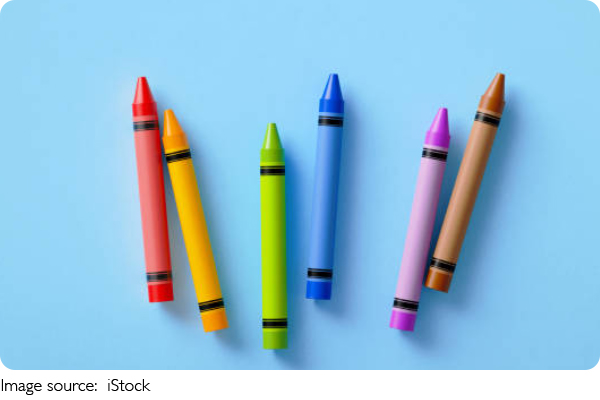
Colors are like the heartbeat of an oil painting — they bring energy, emotion, and life to the canvas. Have you ever noticed how some paintings just grab your attention with boldness and emotion?
That's the power of color harmony and contrast at work. Today, we'll explore how we can use complementary and contrasting colors to create drama and depth, making our oil paintings not only visually striking but emotionally rich.
Understanding Complementary Colors and Their Power
Complementary colors are pairs of colors opposite each other on the color wheel — think red and green, blue and orange, or yellow and purple. When placed side by side, these colors create a vibrant contrast that naturally draws our eyes. This contrast can add a lively energy to a painting, making the elements pop.
When we use complementary colors in oil painting, we don't just place them next to each other randomly. We balance them carefully to avoid overwhelming the viewer. For example, if we have a bold red area, we might introduce a smaller touch of green nearby to enhance that red's intensity without creating chaos. This interplay creates a tension that feels exciting and alive.
How Contrast Elevates Visual Impact
Beyond complementary colors, contrast itself is a broader concept that includes differences in brightness, saturation, and temperature. Contrast helps us guide the viewer's attention, highlight focal points, and create a sense of movement.
We often think of contrast as just light versus dark, but contrasting colors can work the same way. For instance, pairing a muted, soft color with a bright, saturated one can create a powerful visual punch. In oil painting, we can exploit this by layering rich, vibrant colors against calm, neutral backgrounds. This not only emphasizes the subject but also adds dimension and energy to the composition.
The Role of Warm and Cool Colors in Emotional Depth
Warm colors like reds, oranges, and yellows tend to feel energetic, passionate, and inviting. Cool colors like blues, greens, and purples often evoke calm, sadness, or distance. Using warm and cool contrasts side by side in a painting helps us express complex emotions and moods.
For example, when we paint a sunset, the warm golden hues against the cool blue sky don't just represent reality—they create an emotional atmosphere of calmness mixed with excitement. By balancing these temperature contrasts, we add layers of meaning and feeling that connect deeply with viewers.
Tips for Harmonizing Color in Oil Painting
Harmonizing colors isn't about making everything blend perfectly — it's about finding the right balance between harmony and contrast. One way to do this is by mixing complementary colors to create rich neutrals. For instance, mixing a bit of red into green can tone down both colors, resulting in natural shadows or muted areas that balance the composition.
Another tip is to use glazing — applying thin, transparent layers of color over dried paint. This allows warm and cool tones to interact subtly and builds depth slowly, enhancing the painting's emotional complexity.
Creating Drama with Color Layering
We can also build drama by layering contrasting colors. Start with a cool underpainting to establish mood and depth, then apply warm highlights on top to catch the light and draw attention. This technique gives paintings a vibrant tension that keeps viewers engaged.
It's important to experiment with how much contrast we use. Too much contrast everywhere can feel chaotic; too little can be dull. Finding the sweet spot allows our work to feel alive and balanced.
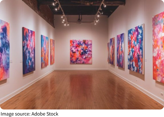
Conclusion: Make Color Your Storyteller
Color in oil painting is a powerful tool that we can use to tell stories, evoke emotions, and create unforgettable images. By mastering complementary colors, exploring contrast, and balancing warm and cool tones, we bring our paintings to life with drama and depth.
So next time you pick up your brush, think about how your colors can speak, how their relationships can create energy and feeling. Let's make color the heart of our art and enjoy the magic it brings to every canvas!
-
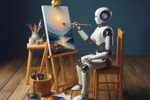 When Art Meets AlgorithmRobots paint masterpieces? Discover how machines and humans unite to co-create stunning, emotional, mind-bending art!
 -
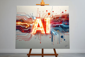 Can AI Truly Create Art?Is a machine-made masterpiece still art? Explore the thrilling debate over creativity, code, and the soul of expression!
 -
 Drawing in the Digital AgeWant to master digital art? Explore innovative styles—from 3D modeling to generative magic—that power today’s creativity!